
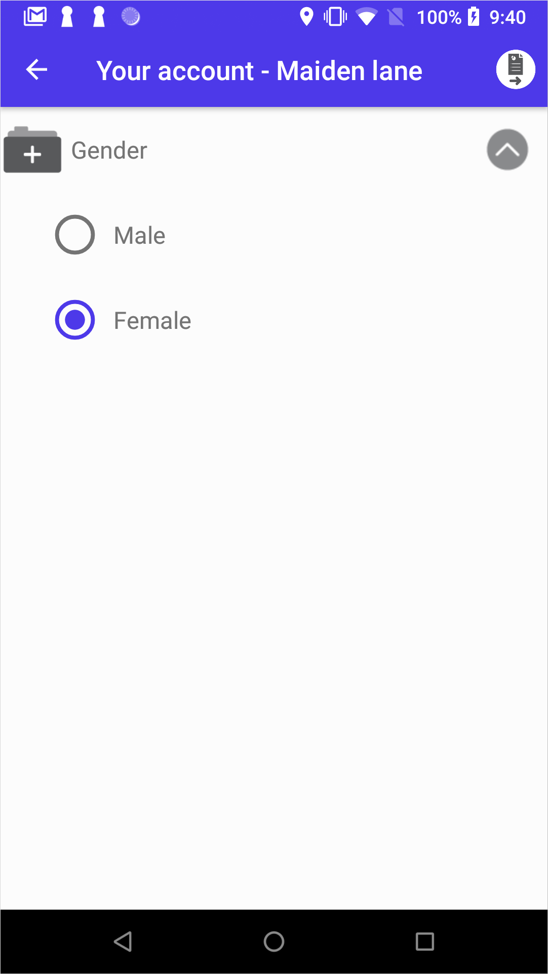
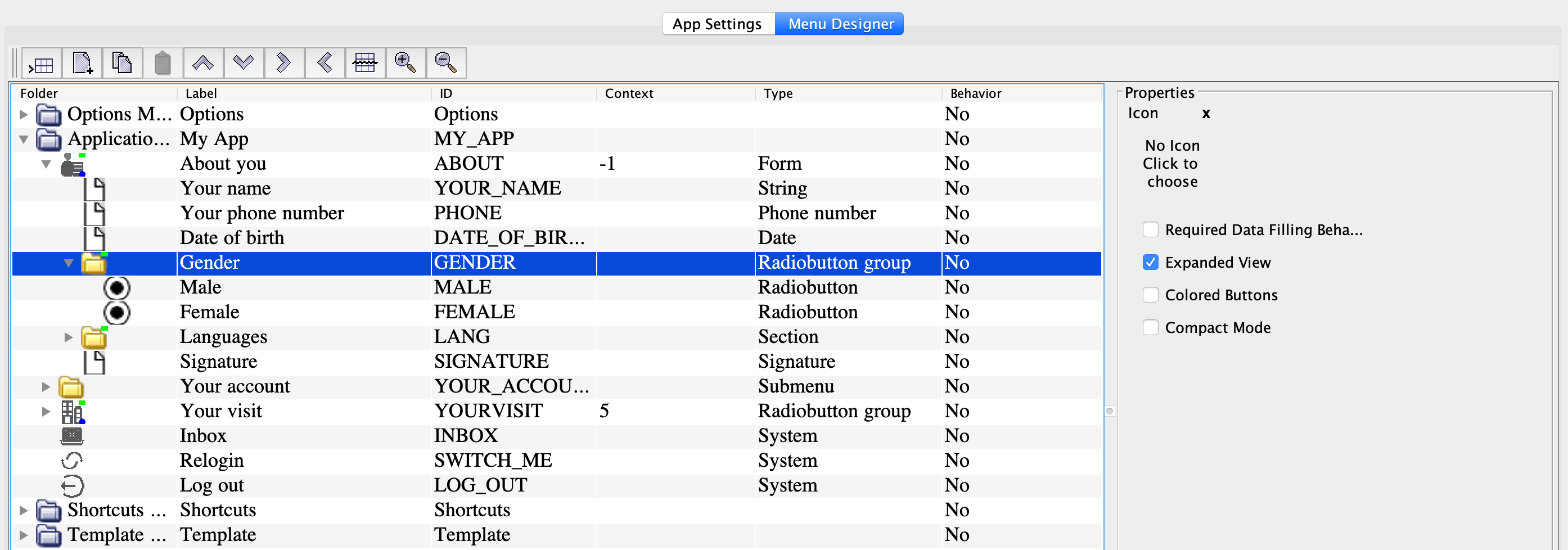
Radiobutton group
The Radiobutton group node adds a group of radio buttons in the form. For more information on how to add a group of radio buttons or buttons, see Add a set of fields.
| Option | Description |
|---|---|
| Required data filling behavior | Indicates if selecting a radio button is required. |
| Expanded view | Display the node expanded when the user opens the form. For example, this option works in case of small radio button groups. |
| Colored buttons | Show the options as buttons. You also need to specify the button color in the embedded Radiobutton nodes (the Node color field). |
| Compact mode | Place the buttons in a row next to one another. The setting is valid for a node with buttons (see the Colored buttons setting). |
| Data info | Information for the user shown next to the node label. |