
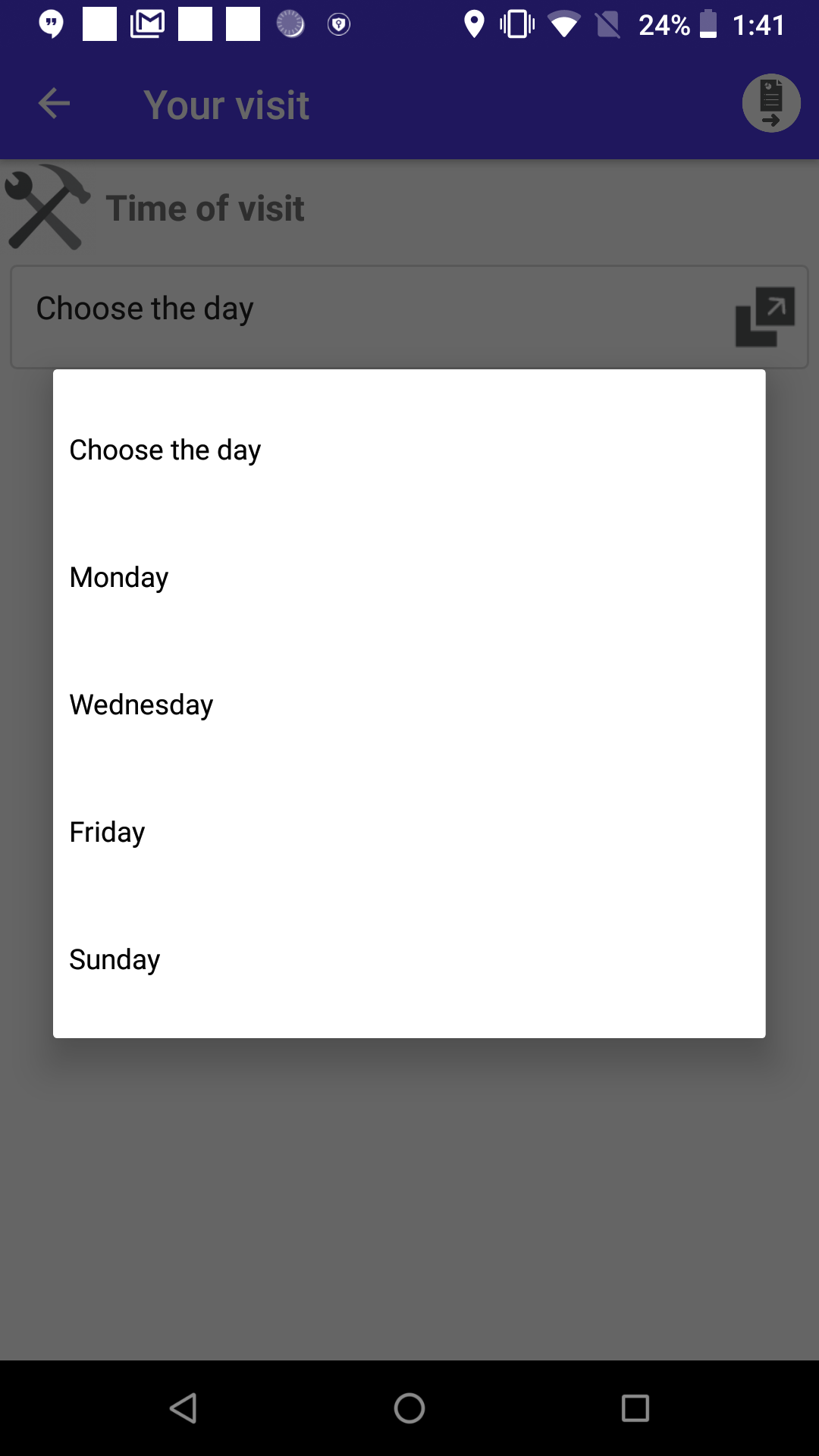
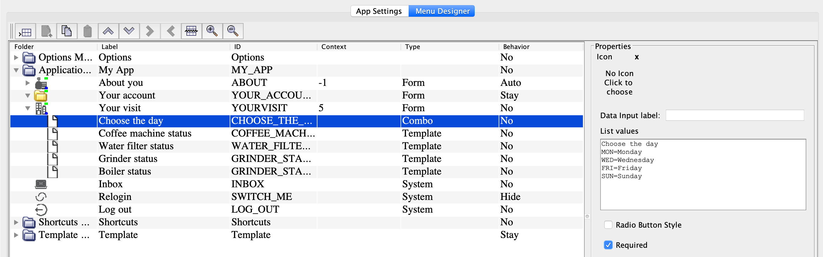
Combo
The Combo node allows the user to select and report a value from the list.
| Option | Description |
|---|---|
| Data Input label | Field label. |
| List Values | The items to select from the list, separated with line breaks.
Each item can contain letters, numbers and special characters. The text length is unlimited. You can add items either as they
should appear in the app or as Or: To specify the item colour, use the pipe character: |
| Radio Button Style | Indicates if the list should be displayed as a group of radio
buttons. By default, values are displayed as a drop-down list. Note: To
make a radio button group, it is recommended to use the
Radiobutton group node. Learn more in the
Add a set of fields section.
|
| Required |
Indicates if the user can leave the field empty. If the field is required but the user didn't select anything, they are prompted to select a value again. Note:
In the required drop-down, the first item in the list is always a non-selectable instruction text, for example, "Choose the item from the list". |
| Data Info | Information for the user shown next to the node label. |