Add a set of fields
App Builder lets group fields in a form. It can be useful if you want to structure a longer form or if you need to use sets of input fields, for example, sets of radio buttons, checkboxes or regular buttons.
Group the form fields in sections
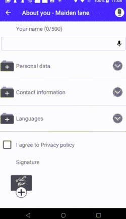
A long form can be divided in collapsible sections so that it is easier to navigate and fill in:
To create a section of fields, like "Personal data", "Contact information" or "Languages" in the example, add a Section node. Then nest the field nodes inside it:
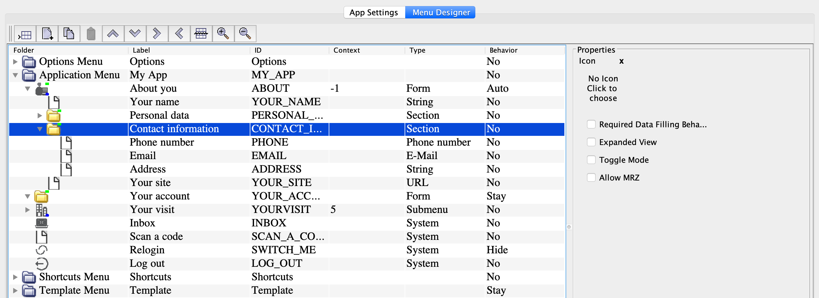
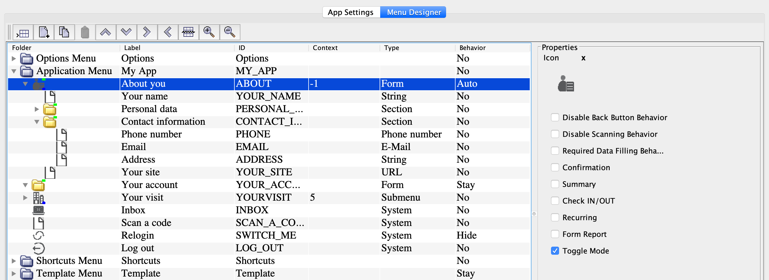
To collapse all other form sections when the user expands a section, set the Toggle mode property for the parent form ("About you").
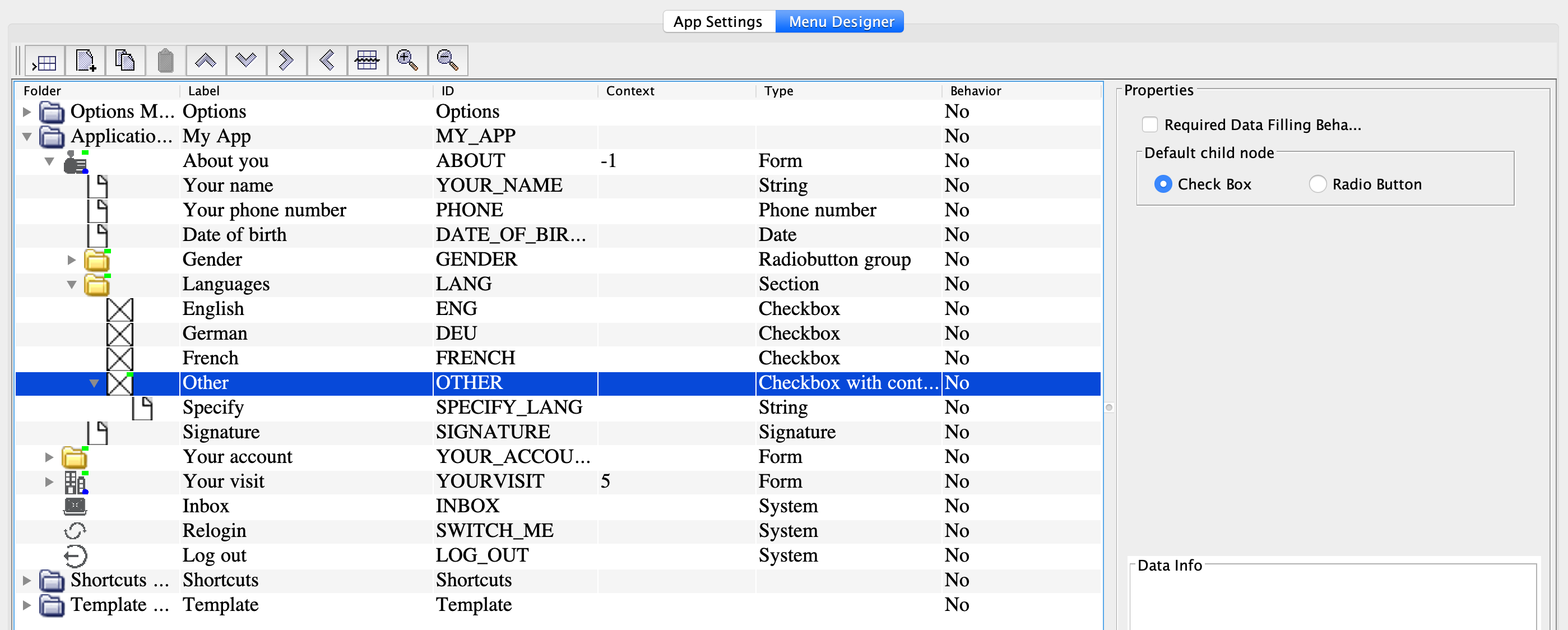
Add a set of checkboxes
A set of checkboxes within a form is displayed as follows:
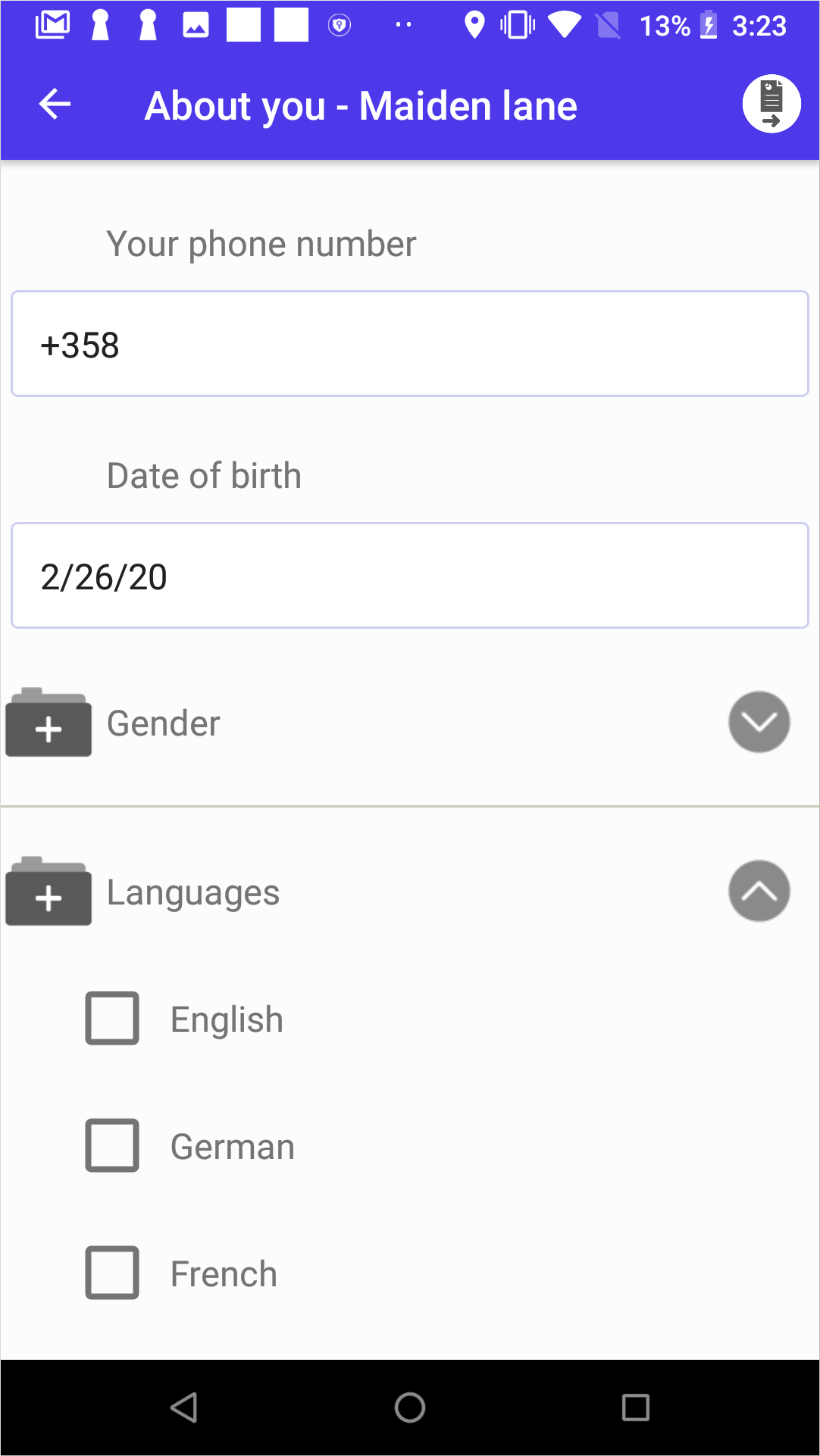
To implement it, add the Section node in the form (the About you form in the example). Then, add the Checkbox nodes for the checkboxes inside:
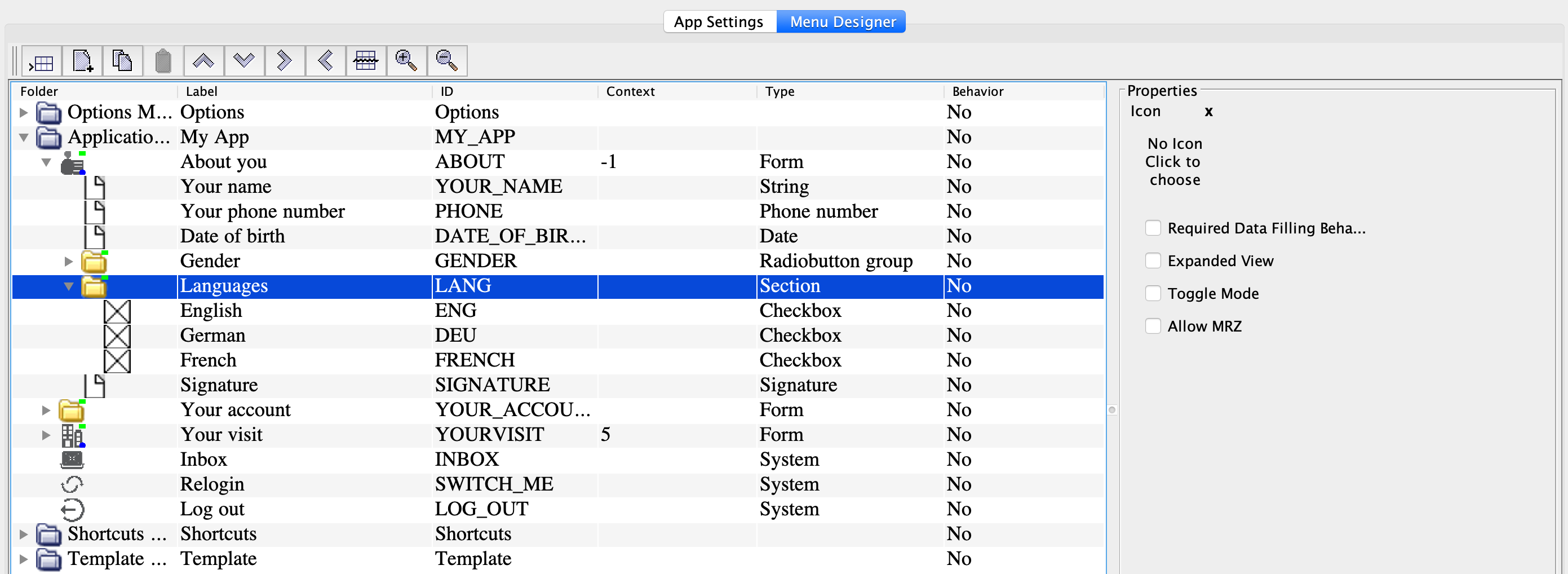
In the Section node properties:
-
Check Required data filling behavior to require selecting at least one checkbox from the section.
- Check Expanded view to make the checkbox group expanded by default.
In the Checkbox node properties, check Selected to make the checkbox ticked by default (this works only if the selection is optional).
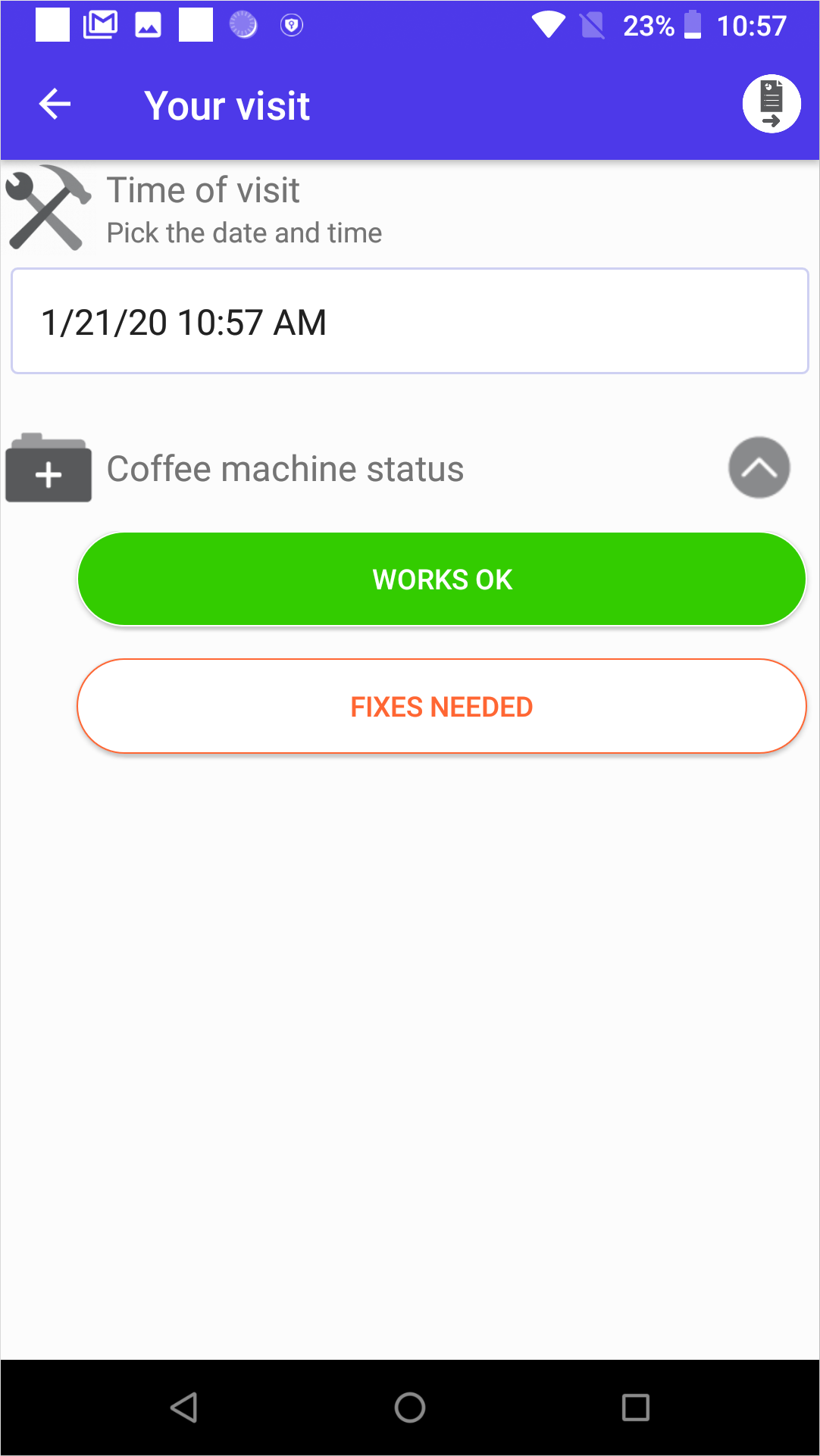
Add a set of radio buttons
A set of radio buttons within a form is displayed as follows:
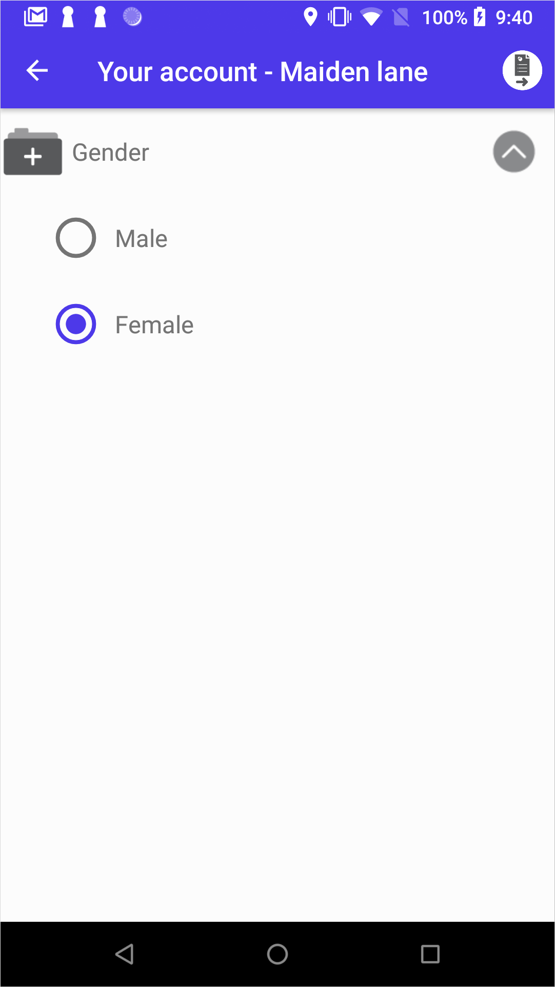
To implement it, add the Radiobutton group node in the form (the About you form in the example). Then, add the Radiobutton nodes inside:
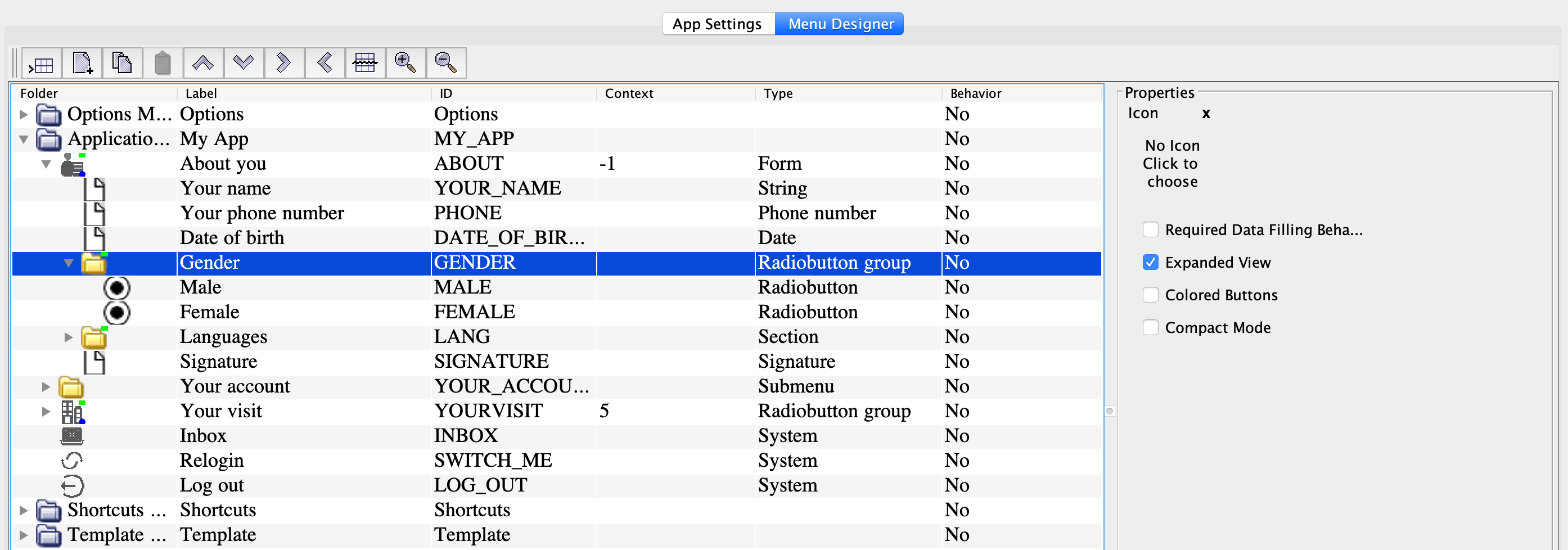
In the Radiobutton group node properties:
-
Check Required data filling behavior to make the option selection required.
- Check Expanded view to make the radio button group expanded by default.
In the Radiobutton node properties, check Selected to make the radio button selected by default (this works only if the selection is optional).
Add a set of buttons
You can display the choice of options as a set of buttons:
To implement it, add the Radiobutton groupnode in the form (the About you form in the example). Then, add the Radiobutton nodes inside.
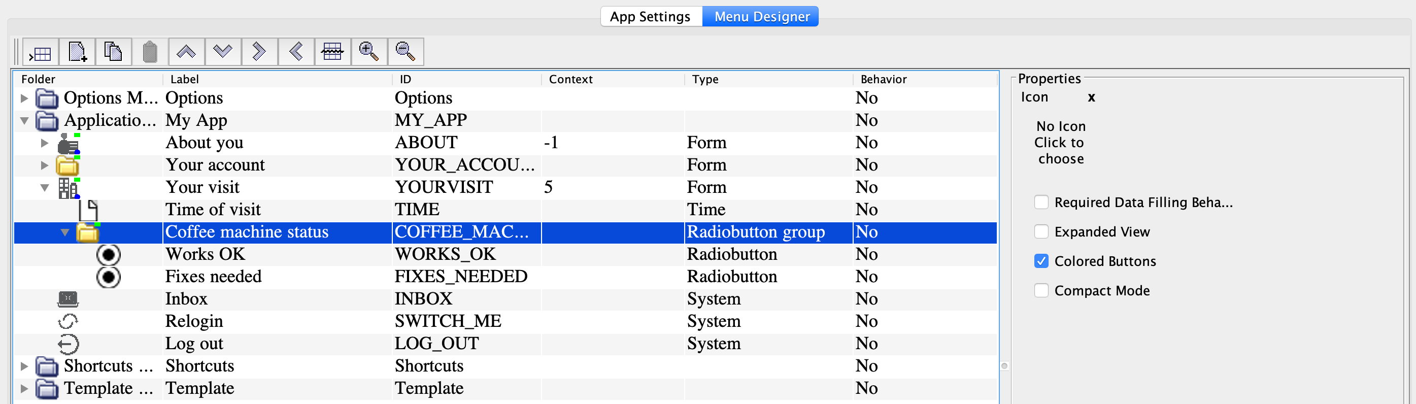
In the Radiobuttons node properties, check the following options:
-
Colored buttons.
-
Required data filling behavior, to make the option selection required.
- Expanded view, to make the button group expanded by default.
-
Compact node, to place the buttons next to one another.
- Set the button color in the Node color field (required).
-
Check Selected to make the radio button selected by default (this works only if the selection is optional).
Add conditional behavior
Conditional behavior enables extra fields if the user selects a certain option. In this example, the Specify input field is shown when the user chooses the Other option.
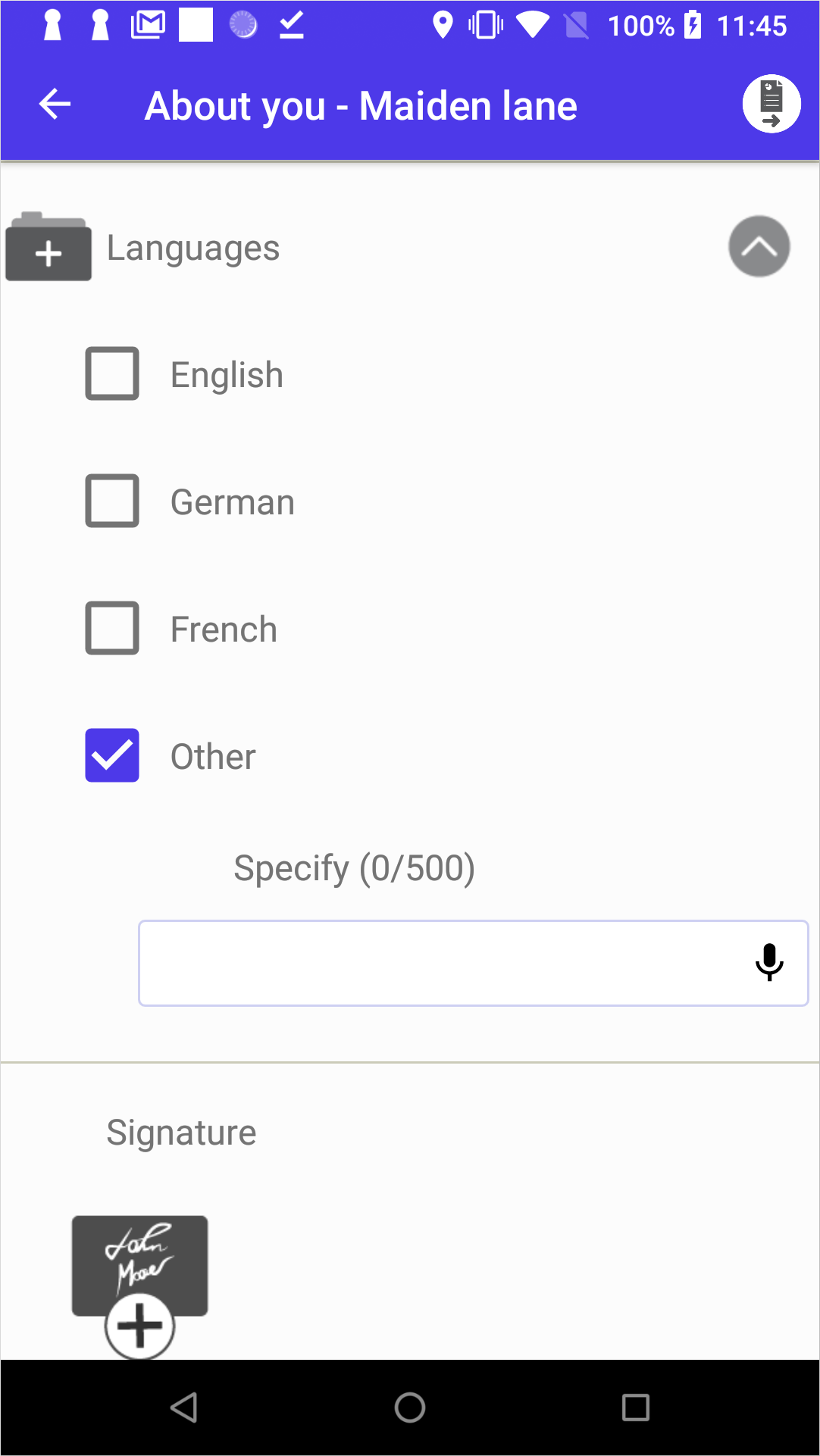
To implement this, create a Checkbox with contents or Radiobutton with contents type (in the example, the Checkbox with contents node is used to create the Other field). Add the extra field(s) (Specify in the example) inside this node.
To be able to add nested checkboxes, tick the Checkbox in the Default child node field.
To be able to add nested radio buttons, tick the Radio button in the Default child node field.